The Rate of Change: June 24, 2019
Happy solstice! For those of you in the Northern Hemisphere, Friday June 21 marked the summer solstice, or the longest day of the year, while in the Southern Hemisphere, it was the winter solstice, or the shortest day of the year.
Fun fact: If you make a graph of the length of daylight versus the day of the year, you end up with a shape that looks like a sine curve. The summer and winter solstices are the maximum and minimum values of this graph. As Steven Strogatz noted on Twitter, the four special points on this graph — maximum, minimum, and the two times that it passes through the midpoint — mark the start of the four seasons of the year. As you go towards the equator, this graph becomes flatter, and so the effect of seasons becomes less pronounced. If you’re interested in learning more about this relationship, there’s a nice section of Strogatz’s book Infinite Powers that explores this daylight graph.
Graphs of The Week
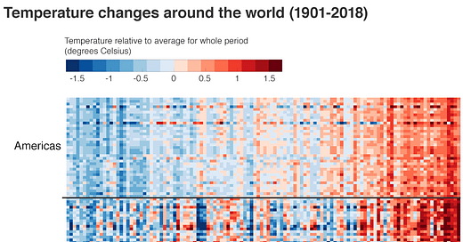
The chart that defines our warming world

Each line of coloured pixels is the temperature record of an individual nation within its region, stacked one atop the other. Blues are cooler years; the reds are warmer. The far left is 1900; the far right is the present day.
Read more at BBC News. Here’s what the average temperature graph for the entire globe looks like:

You can download a ‘Climate Stripes’ graphic for your country at Show Your Stripes, developed by Ed Hawkins at the National Centre for Atmospheric Science, University of Reading.
Our Air is Now 0.0415% Carbon Dioxide
In May 2019, we crossed another invisible line in the sand — the concentration of carbon dioxide in our atmosphere surpassed 415 parts per million, or 0.0415%. Prior to the industrial revolution, this number was at 280 parts per million, or 0.028%.
A plot shared by paleoclimatologist Gavin Foster in a tweet and blog post shows us that the last time carbon dioxide levels were this high was nearly 2.5 million years ago.


Today, we’re on the far right end of the graph. The last time levels were this high was when the red dotted line intersects the data, over on the left, about 2.5 million years ago. Back then, sea levels were 10 to 20 meters higher, and the global climate was 3 degrees Celsius warmer. Here is what that era looked like in terms of human evolution.
Climate Stories of the Week
Arctic permafrost is thawing 70 years sooner than predicted
Permafrost at outposts in the Canadian Arctic is thawing 70 years earlier than predicted, an expedition has discovered, in the latest sign that the global climate crisis is accelerating even faster than scientists had feared. [..]
“What we saw was amazing,” Vladimir Romanovsky, a professor of geophysics at the university, told Reuters. “It’s an indication that the climate is now warmer than at any time in the last 5,000 or more years.”
Read More in The Guardian
Human activity is causing more and more animals to embrace the night
By Elizabeth Gamillo in Science News.
This article is based on freely available research published in the journal Science. Here’s an interesting figure from the research paper showing how, throughout the world, mammals are becoming more nocturnal to avoid humans. The green dots represent how nocturnal different animals are in areas with ‘low human disturbance’, and the red dots show the same species in areas with ‘high human disturbance’. A shift towards the right = becoming more nocturnal in the presence of humans.

On an anecdotal note, I used to live in an area with a lot of deer, and noticed that they would start coming out and grazing around sunset, and were often active well into the night.
The Himalayas are Melting
According to a study published today in the journal Science Advances, rising temperatures in the Himalayas have melted nearly 30 percent of the region’s total ice mass since 1975. Once nicknamed Earth’s ‘Third Pole’ for its impressive cache of snow and ice, the Himalayas may now have a bleak future ahead. Four decades of satellite data, including recently declassified Cold War-era spy film, suggest these glaciers are currently receding twice as fast as they were at the end of the 20th century.
Read more by Katherine Wu at Nova. This article is based on freely available research published in Science Advances.
Somini Sengupta also did a great job covering this story at the New York Times.
If you’re interested in reading more about the future of the Himalayas, there’s a recently published open access book available sharing climate research on this region.
Why Chennai, India's Sixth Biggest City, Has Run Out of Water
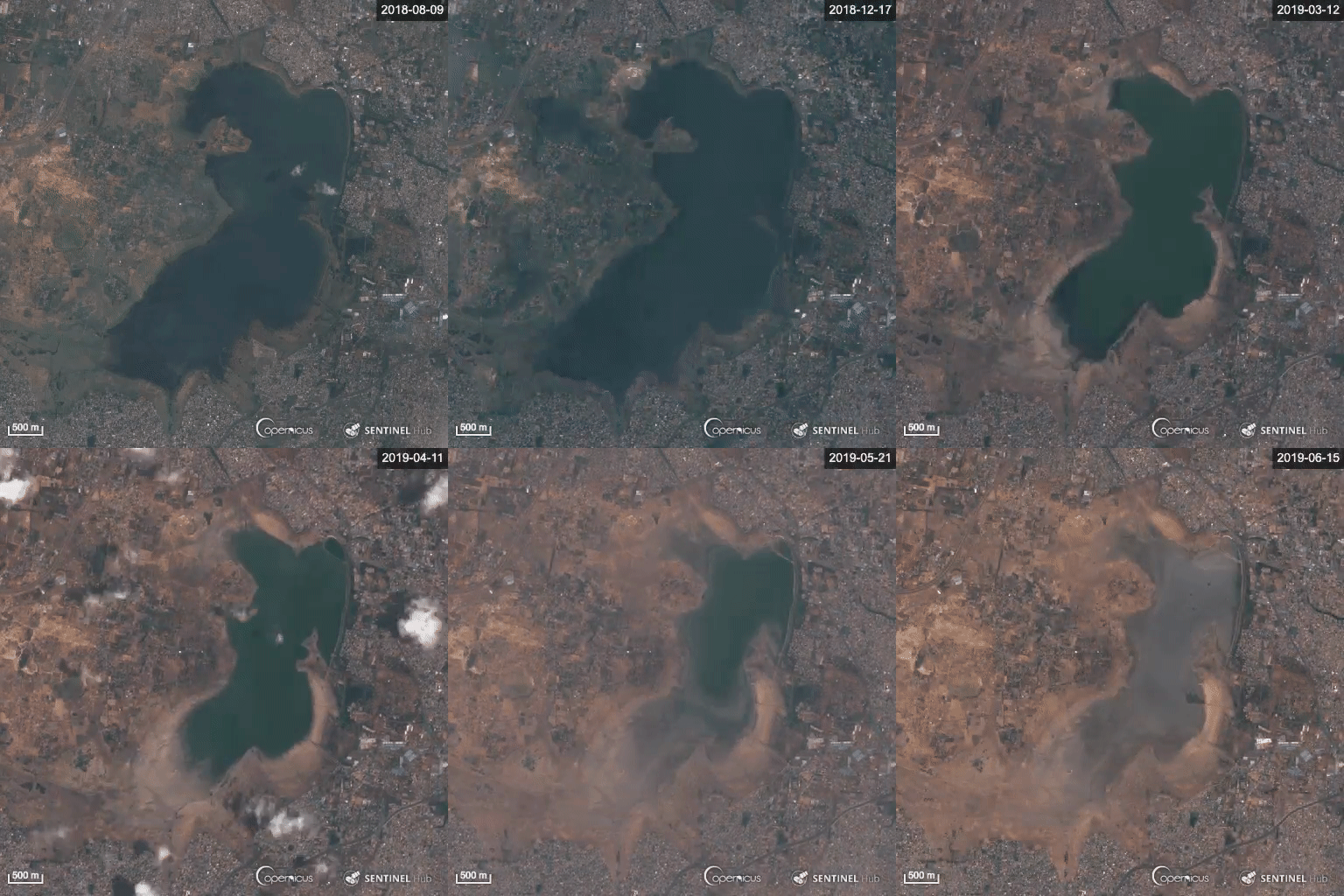
In what’s becoming an increasingly common story, a major city has run out of water. Chennai, India is home to 4.65 million and a severe deficit of water to serve their needs.
Read more by Brian Kahn at Gizmodo.
In a tweet, story author Brian Kahn shared an animated gif showing satellite imagery of one of Chennai’s water reservoirs being depleted.


How the UK transformed its electricity supply in a decade
Back in 2008, as the Climate Change Act was becoming law, some four-fifths of the UK’s electricity came from fossil fuels – and climate campaigners were resisting plans for a new fleet of coal-fired power stations. Emissions from the sector had barely changed for years, making it the largest contributor to the UK’s total by far.
Since then, the UK has cleaned up its electricity mix faster than any other major world economy. Coal-fired power has virtually disappeared and even gas use is down by a quarter. Instead, the country now gets more than half of its electricity from low-carbon sources, such as solar, wind and nuclear. Renewables have filled the gap left by fossil fuels, along with falling electricity demand.
Read more in this interactive article by Simon Evans and Rosamund Pearce at Carbon Brief, mapping every power plant in the UK over the last decade.
On a related note, the UK recently set a record for going 18 days without coal power.
The hidden strengths of freshwater mussels
They funnel food downward, fueling life in the riverbed and clarifying water for other species. They help to mitigate nutrient pollution, a widespread problem that leads to dead zones in some waters.
And today they are in trouble, with one of the highest extinction and imperilment rates on the planet. In North America alone, 30 freshwater mussel species have gone extinct over the last century, and 65 percent of those surviving are considered endangered, threatened or vulnerable — primarily due to the large-scale damming of rivers.
Read more by Sharon Levy at Knowable Magazine
Climate Change has Likely Already Affected Global Food Production
A recent study published in the journal PLOS One makes the case that climate change has already led to approximately a percent of reduction in food calories produced from the top ten food crops (barley, cassava, maize, oil palm, rapeseed, rice, sorghum, soybean, sugarcane and wheat).
Metrics to Know
Energy: Frequently measured in kWh or kiloWatt hours. A kiloWattHour is roughly the amount on energy consumed by a 40 Watt incandescent light bulb if you leave it switched on over an entire day. This is the standard unit by which electricity is billed, and so you’ll find this unit on your electricity bill.
Let’s do the math: 1 kiloWatt hour = (1 kiloWatt or 1000 Watts) × (1 hour or 60 × 60 seconds or 3600 seconds) = 1000 × 3600 Watt seconds = 3.6 million Joules
1 kiloWatt hour per day = 3.6 million Joules / (24 hours or 24 × 60 × 60 seconds) = 41.66 Joules/second = 41.66 Watts
So if you use 1 kiloWatt hour of energy in a day, this is roughly the same rate of energy consumption as a 40 Watt incandescent light bulb.
Carbon Intensity (or Emission Intensity): This measures how much carbon is used to produce energy. It’s measured in gCO2/kWh, or grams of carbon dioxide per kWh. If an energy source has a carbon intensity of 200 gCO2/kWh it means that, on average, consuming a kWh of this energy releases 200 grams of carbon dioxide. Here’s how different energy sources compare in terms of energy intensity.


